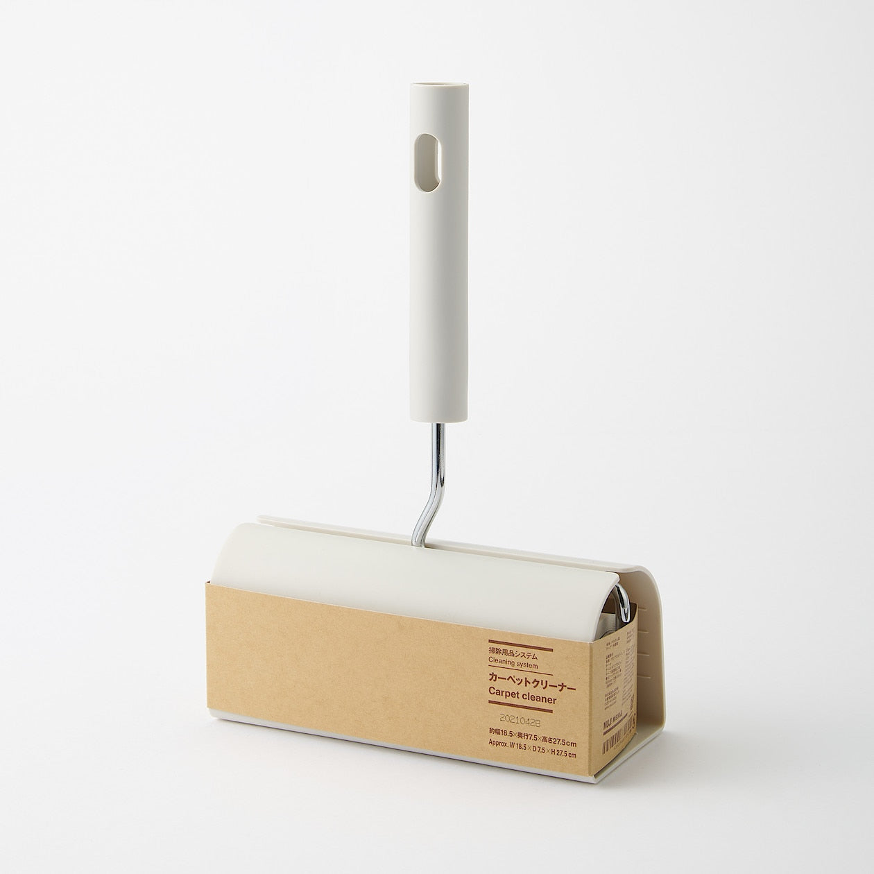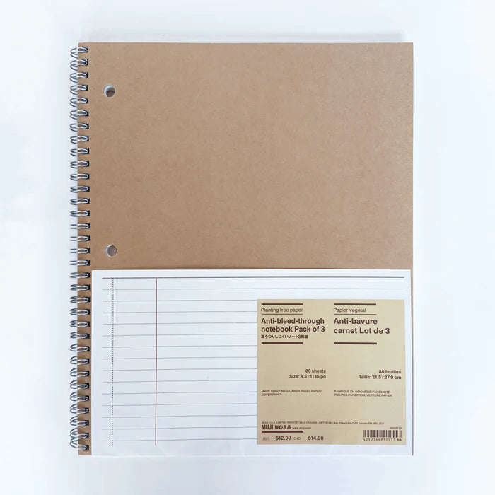
The packaging's evolution emerged from a distinct perspective, employing recycled paper tones to evoke a sense of simplicity in lifestyle, while Tanaka's striking red logo cemented MUJI's unmistakable brand identity.

Focused on simplicity and the elimination of unnecessary packaging, MUJI aims to highlight the intrinsic appeal of its products. This minimalist packaging ethos is evident across all of MUJI's offerings, from furniture to skincare products and more.

The brand's innovative tagging system, through stickers, tags, or direct printing, serves to seamlessly integrate product information while reflecting the essence of each item's purpose. This holistic approach underscores MUJI's dedication to providing products that resonate with users on a deeper level, embodying simplicity and functionality in every aspect of their design and presentation.


